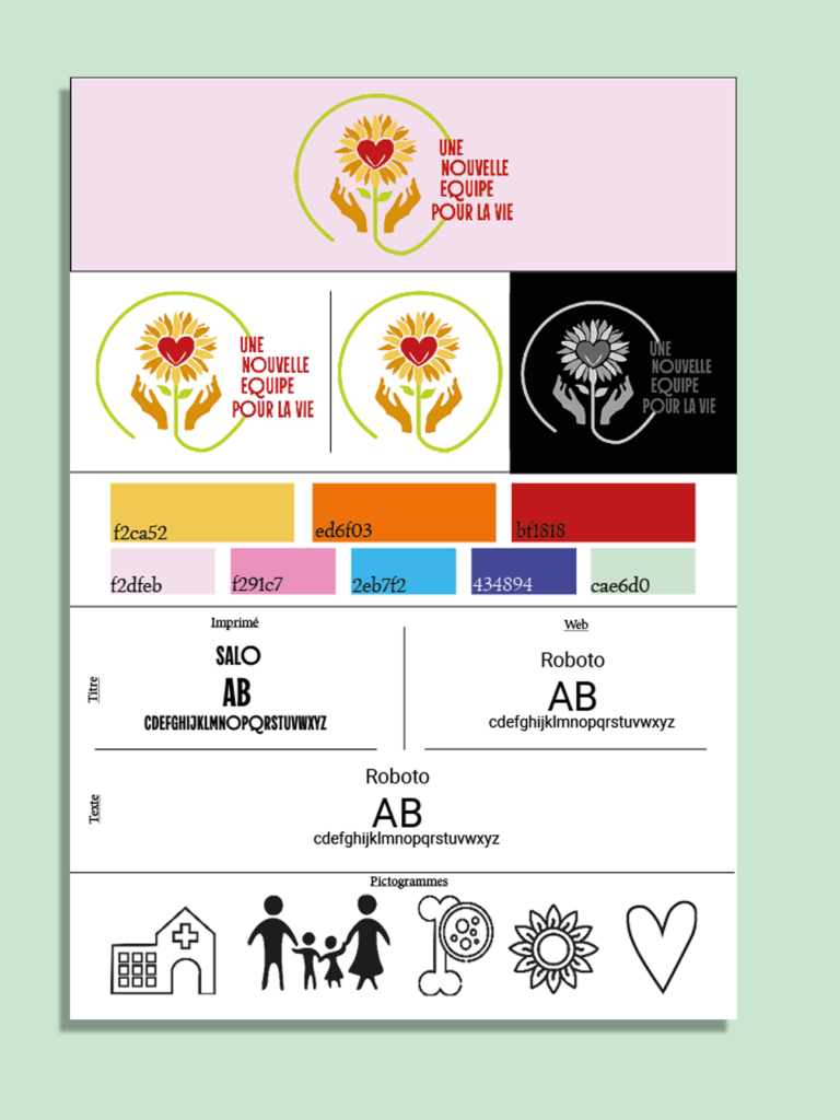
La première chose que j’ai faite pour l’association a été de revoir leur logo. Les couleurs de l’ancien le faisaient paraître un peu vieilli, alors je l’ai redessiné sur Illustrator et j’ai rendu les couleurs plus vives et dynamiques.J’ai ensuite utilisé les trois couleurs principales du logo comme base de l’identité graphique de l’association.
Révision de leurs identité de marque
Après le logo, j’ai revu l’identité visuelle ainsi que le design global et les couleurs de l’association. J’ai réalisé un brandboard, sur les conseils de mon enseignante. Vous pouvez le découvrir en cliquant sur le bouton ci-dessous !
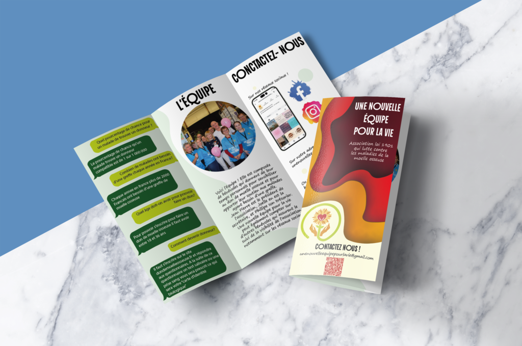
Voici deux de mes essais de création de flyers pour l’association. Celui de gauche n’a pas été retenu, car ces taches rouges foncées rappelaient trop l’univers du cancer, ce qui est à l’opposé de l’image que nous souhaitions véhiculer. Nous voulions quelque chose de joyeux et porteur d’espoir. Celui de droite représente beaucoup mieux l’esprit de l’association et de l’équipe qui la fait vivre !
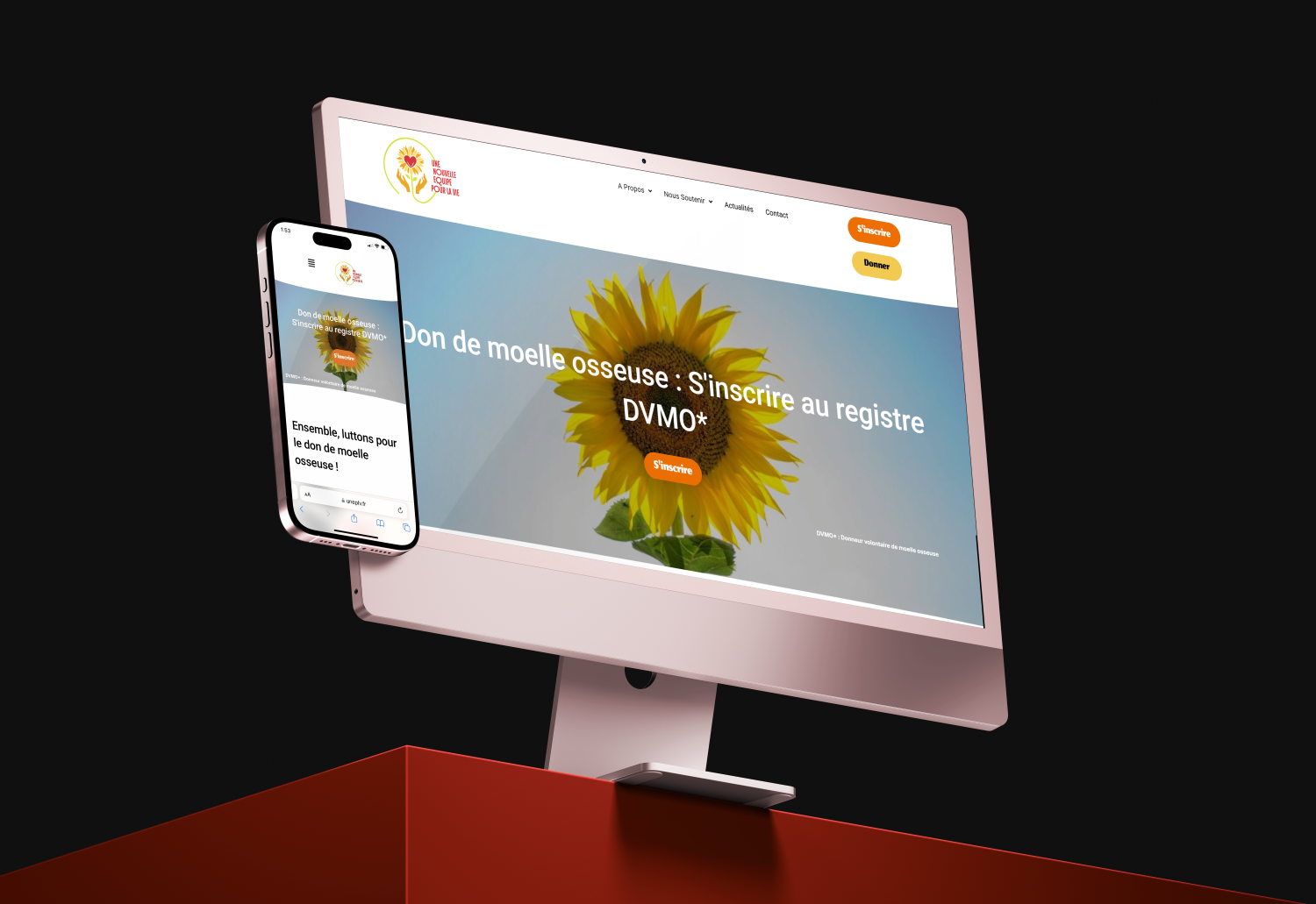
Conception de leur site web
Le prochain défi que nous avons rencontré en gérant la communication de l’UNEPLV a été de concevoir leur site web. Cette tâche m’a été confiée, et je suis très contente des progrès que j’ai réalisés sur WordPress et Elementor ! J’ai également réalisé un prototype du site (et une maquette) sur Figma. Cliquez sur l’image pour voir les détails du projet !